
Why measure socioeconomic outcomes?
Although a person or family’s socioeconomic status does not define them or their contribution to society, there are many good reasons to measure socioeconomic outcomes. There are many, many people who have a considerable positive effect on those around them and the nation as a whole, despite having relatively low levels of education, low income, or at a particular point in time finding it difficult to gain and maintain paid employment. Nonetheless, socioeconomic status matters for a person’s life chances. Having a relatively high level of income protects people and communities from the risk of material deprivation, affords individuals and communities more autonomy, and enables a long-term focus when making decisions. Education can increase a person’s control over their own lives in a variety of ways. Quality and stable housing is important to everyday wellbeing and is a key predictor of health outcomes across the lifecourse.
The Aboriginal and Torres Strait Islander (Indigenous) Australian population experience a greater degree of socioeconomic disadvantage than much of the rest of the Australian population across a range of measures. This relative disadvantage does not characterise Indigenous Australians or their role in Australia’s past, present and future. And there is much more to a ‘good life’ for Indigenous Australians than simply material resources and Western notions of socioeconomic status. However, almost all Indigenous community leaders argue for improvements in income, education, employment and housing for the people they represent.
Measuring socioeconomic outcomes for Aboriginal and Torres Strait Islander Australians
Over a number of years, researchers in the Centre for Aboriginal Economic Policy Research (CAEPR) have been examining the area-level and individual distribution of socioeconomic outcomes for the Indigenous population. Using a consistent methodology, we have examined outcomes for the 2001, 2006, and 2011 Censuses. This research has documented a number of stylised facts:
- There is a wide range of socioeconomic outcomes within the Indigenous population by area;
- Indigenous Australians living in remote areas tend to have worse socioeconomic outcomes than those living in non-remote areas – but there are a number of highly disadvantaged urban areas, and not all remote areas are equally disadvantaged;
- There is considerable stability through time at the area level in terms of socioeconomic outcomes;
- In every area in Australia, the Indigenous population has worse outcomes on average than the non-Indigenous population; and
- Inequality between the Indigenous and non-Indigenous population is largest in remote areas.
New data from the 2016 Census of Population and Housing allows us to replicate this analysis and examine how the distribution of outcomes are changing over the short and the long term. We use the same methodology as previous years (outlined in the link above). In essence, we calculate an Indigenous Relative Socioeconomic Outcomes (IRSEO) Index that summarises the distribution of outcomes at the small-area level according to nine socio-economic measures of the usual resident population of an area. These are, the proportion of the:
- Population 15 years and over employed;
- Population 15 years and over employed as a manager or professional;
- Population 15 years and over employed full-time in the private sector;
- Population 15 years and over who have completed Year 12;
- Population 15 years and over who have completed a qualification;
- Population 15 to 24 years old attending an educational institution;
- Population 15 years and over with an individual income above half the Australian median;
- Population who live in a house that is owned or being purchased; and
- Population who live in a house with at least one bedroom per usual resident.
In the first set of analysis, we calculate the index for the Indigenous population in the area. We then repeat the analysis for the Indigenous and non-Indigenous population of the same area (separately) and create the Pooled Indigenous and Non-Indigenous Relative Socioeconomic Outcomes (PINIRSEO).
Distribution of socioeconomic outcomes by area within the Indigenous population
The figure below summarises the distribution of Indigenous socioeconomic outcomes in 2011 and 2016 for 408 Indigenous Areas across Australia. A low value indicates that the Indigenous usual residents of that area were relatively advantaged in the relevant year, whereas a high value indicates they are relatively disadvantaged. Areas above the 45° line are those that have worsened (relatively) over the last inter-censal period, whereas those below the line have improved. Because this is a relative measure, it is important to remember that for each area that improves in socioeconomic outcomes, another area must record relatively worsened outcomes. We use a different symbol for seven different location-types, based on the size, remoteness and Indigenous population share of the area.
Figure 1: Indigenous Relative Socioeconomic Outcomes (IRSEO) Index – 2011 and 2016
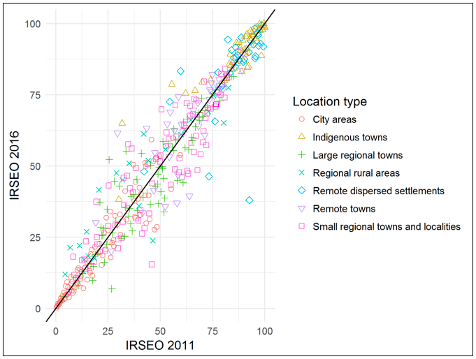
The most advantaged Indigenous Australians (with low IRSEO scores) tend to live in city areas, whereas the most disadvantaged (with high IRSEO scores) tend to live in Indigenous Towns (urban centres where more than half of the usual resident population is Indigenous) or Remote Dispersed Settlements. The most advantaged areas in Australia are Sydney – Lower North (NSW); Woollahra – Waverley (NSW); and Melbourne – East (NSW) in that order, whereas the most disadvantaged are in Ampilatwatja and Outstations (NT); Walungurru and Outstations (NT); and Urapuntja (NT).
There are, however, some variations to these patterns. Blacktown (NSW); Belmont (WA); and Port Adelaide – Enfield and Playford (both in SA) are part of large cities but also rank in the bottom half of the distribution nationally. Kalgoorlie – Ningia Mia (WA); Port Augusta (SA); and Coconut Grove – Ludmilla (NT) are in large regional towns and close to or in the bottom quarter of the distribution nationally. Alternatively, Barcaldine – Blackall – Longreach (Qld) is an area in remote Australia that is in the top quarter of the distribution, and there are a number of other remote towns, remote dispersed settlements and Indigenous towns that are in the top part of the distribution.
There were a number of areas that changed their relative ranking between 2011 and 2016. Controlling for where the areas were on the distribution in 2011 (and the fact that it is difficult for advantaged areas to improve in their ranking by a large amount and disadvantaged areas to worsen)[1], City Areas improved the most between 2011 and 2016 in relative terms, followed by Large Regional Towns and Small Regional Towns and Localities. Indigenous Towns and Remote Dispersed Settlements worsened by the greatest amount. In other words, the was a growing divergence between average socioeconomic outcomes of Indigenous people in cities on the one hand, and Indigenous Towns and Remote Dispersed Settlements on the other.
Until individual-level data with a longitudinal component is made available, it is impossible to tell whether these changes are due to improvements in outcomes for those who live in the area, a change in the composition of those who live in the area due to internal migration, or a change in the population composition due to identification change.
Comparisons between Indigenous and non-Indigenous Australians
The IRSEO index contains information on the relative socioeconomic position of Indigenous Australians who live in one area compared to those who live in another. It also allows us to measure the change through time in this relative distribution. It has no information, however, on the difference between Indigenous and non-Indigenous outcomes. The Pooled Indigenous and Non-Indigenous Relative Socioeconomic Outcomes (PINIRSEO) Index has been designed to facilitate such comparisons.
The following figure summarises this distribution in 2016 for the 369 Indigenous Areas with at least 100 Indigenous and at least 100 non-Indigenous adults. The level of disadvantage for the Indigenous population is plotted on the X-axis, whereas the level of disadvantage for the non-Indigenous population in the same area is plotted on the Y-axis.
Figure 2: Pooled Indigenous and non-Indigenous Relative Socioeconomic Outcomes (PINIRSEO) Index – 2011 and 2016
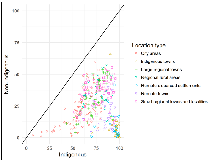
The simplest way to interpret the above figure is to keep in mind that if the outcomes of the Indigenous population in an area were better than the non-Indigenous population in the same area, then the area would be plotted above the black 45° line. If the outcomes were the same, then it would be on the line, and if the outcomes were worse amongst the Indigenous population then the dot would be below the line. The distance from the line represents the within-area gap between Indigenous and non-Indigenous outcomes.
Like in previous Censuses, there was no area in Australia where the Indigenous population had better or equal outcomes to the non-Indigenous population. Compared to 2011, the average difference between Indigenous and non-Indigenous outcomes was almost exactly the same.
The areas where the difference in socioeconomic outcomes between Indigenous and non-Indigenous residents was smallest were Sydney – Lower North (NSW); Canterbury – Bankstown (NSW); Melbourne – East (Vic); and Tasmania – West Coast (Tas). On balance, differences were smallest in City Areas, Regional Rural Areas; Large Regional Towns; and Small Regional Towns and Localities (in that order). The largest gaps were in Thamarrurr inc. Wadeye (NT); Marthakal Homelands – Galiwinku (NT); Ramingining Milingimbi and Outstations (NT); and Maningrida and Outstations (NT) in that order, all of which were in Indigenous Towns.
The relationship between the Indigenous ranking in the area and the non-Indigenous ranking is quite weak (correlation coefficient of 0.12). There are some areas with relatively advantaged Indigenous and non-Indigenous populations (e.g. Sydney’s North Shore), as well as others where both populations are relatively disadvantaged (e.g. Fairfield, in Sydney’s Western Suburbs). On balance though, the socioeconomic status of the non-Indigenous population in an area is not a good indication of the socioeconomic status of the Indigenous population. Given the numerical dominance of the non-Indigenous population in almost all parts of Australia, this means that indices based on the total Australian population are not a good proxy for the distribution of Indigenous socioeconomic outcomes.
Conclusions and implications for tax and transfer policy
The most important implication of the data summarised in this paper is for the Indigenous population itself. While there is more to a ‘good life’ than high levels of education, employment, housing and income, these things are clearly very important and have been shown to correlate with measures of subjective wellbeing (to varying degrees) for the Indigenous population.
There are also, however, implications for tax and transfer policy more broadly. Fortunately, in Australia the system of Horizontal Fiscal Equalisation means that the tax paid by Indigenous Australians does not have an overly large bearing on the services that they receive. Nonetheless, the data does highlight the differing potentials of local governments (as well as State/Territory governments) to levy taxes due to the uneven distribution of Indigenous people and socioeconomic disadvantage across the country.
The results also have implications for the distribution of Indigenous-specific services and associated funding. We would argue that there are services that need to be delivered differently to all Indigenous Australians. Regardless of whether they live in highly advantaged parts of Sydney or remote towns in the Northern Territory, all Indigenous Australians are likely to benefit from a school curriculum that is culturally appropriate; a workplace or housing market that is free from discrimination; and a health system that takes into account the ongoing effect of intergenerational trauma from past policy failures. There are, however, other services that would benefit from being culturally appropriate that would need to be concentrated in areas where the Indigenous population is relatively disadvantaged (for example income support, employment services, disability services).
The current distribution of funds across Australia designed and administered by the Commonwealth Grants Commission takes into account the level of disadvantage of the total Australian population, as well as the number of Indigenous Australians. There is no consideration of the intersection between these two. We would argue that the Indigenous population itself, ideally through a representative body like the former Aboriginal and Torres Strait Islander Commission (ATSIC) or that proposed in the Uluru Statement from the Heart is best placed to consider whether Indigenous-specific services and related funding should be apportioned by socioeconomic status or similar measures. We hope that the data presented in this paper would help to facilitate that discussion.
The indices described here are available for download:
- IRSEO for Indigenous Areas
- PINIRSEO for Indigenous Areas
- IRSEO for SA2s, constructed using Indigenous Area concordances
[1] To measure this, we undertook a simple linear regression with change in percentile rank between 2011 and 2016 as the dependent variable, and percentile rank in 2011 as a control variable. We then included a dummy variable for each of the location types, with city areas as the omitted category.


Recent Comments